Project : EXO - XOXO / The 1st studio album
Role
Graphic design, assistant art director
• Concept planning & visual development • Graphic design (graphic systems, album packaging, release visuals)
• Photo production coordination • External creative collaboration coordination
• 컨셉 기획 및 개발 • 그래픽 디자인 (그래픽 시스템, 앨범 패키지, 릴리즈 비주얼)
• 촬영 컨셉 개발 및 제작 조율 • 외부 크리에이티브 협업 조율
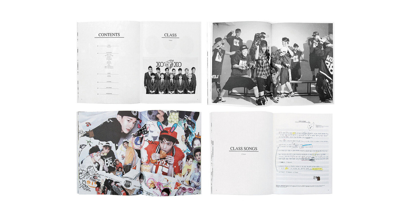
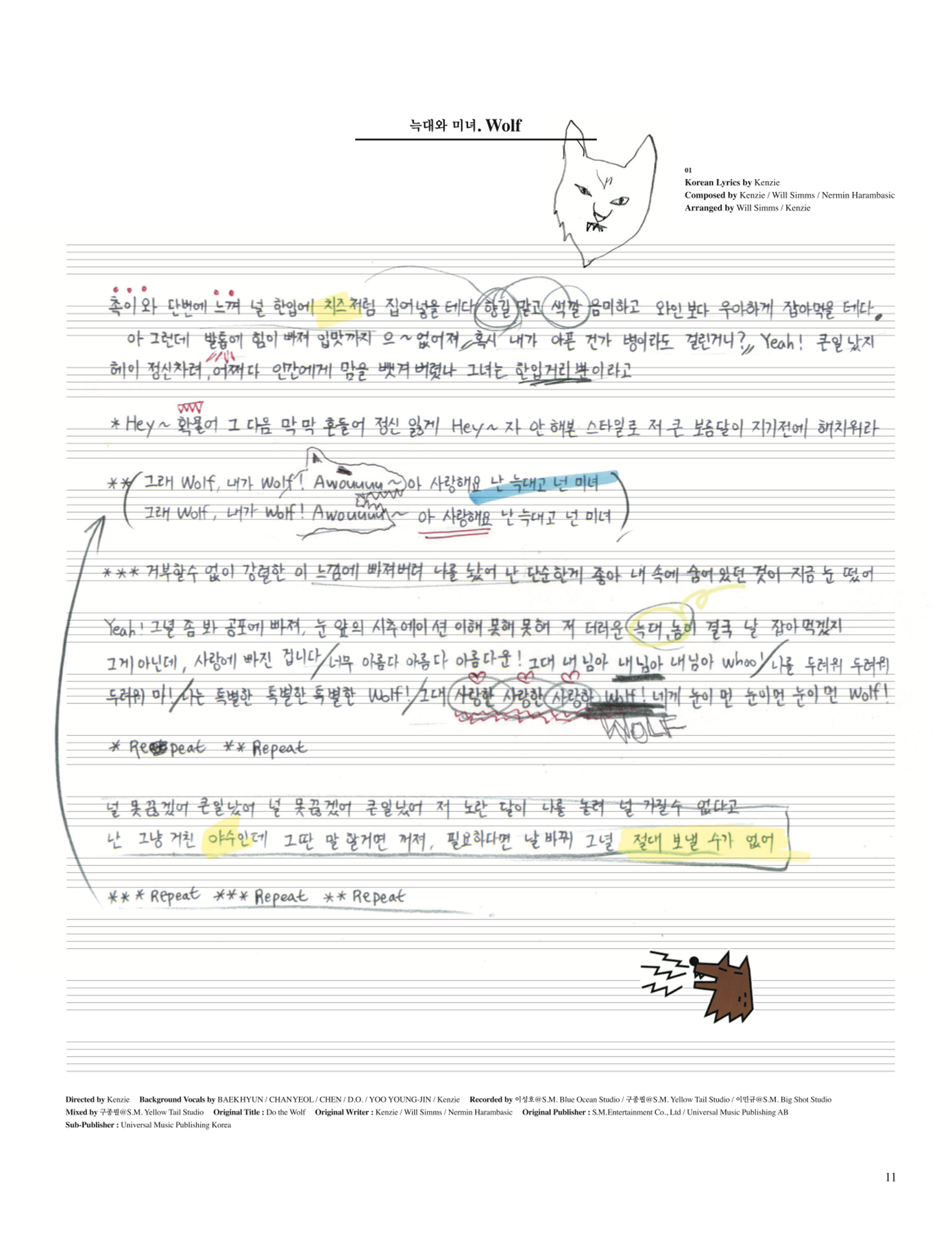
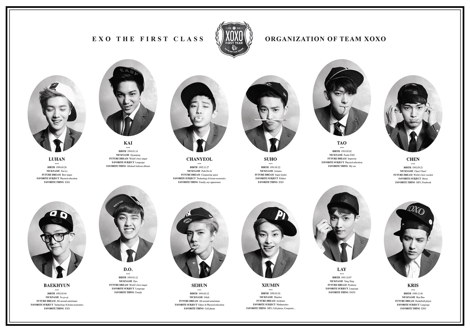
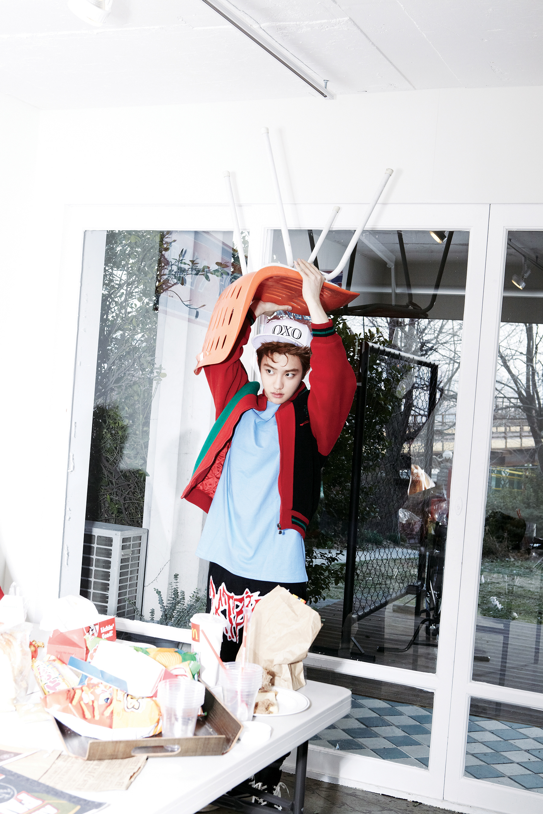
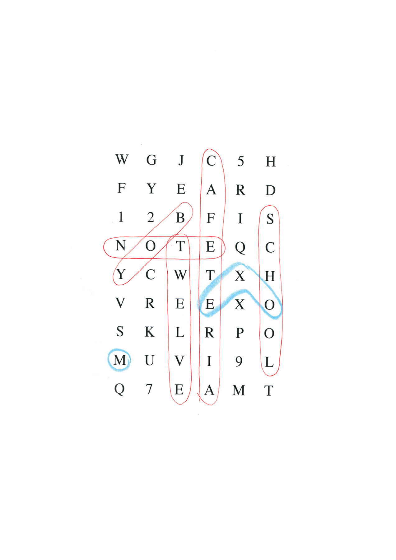
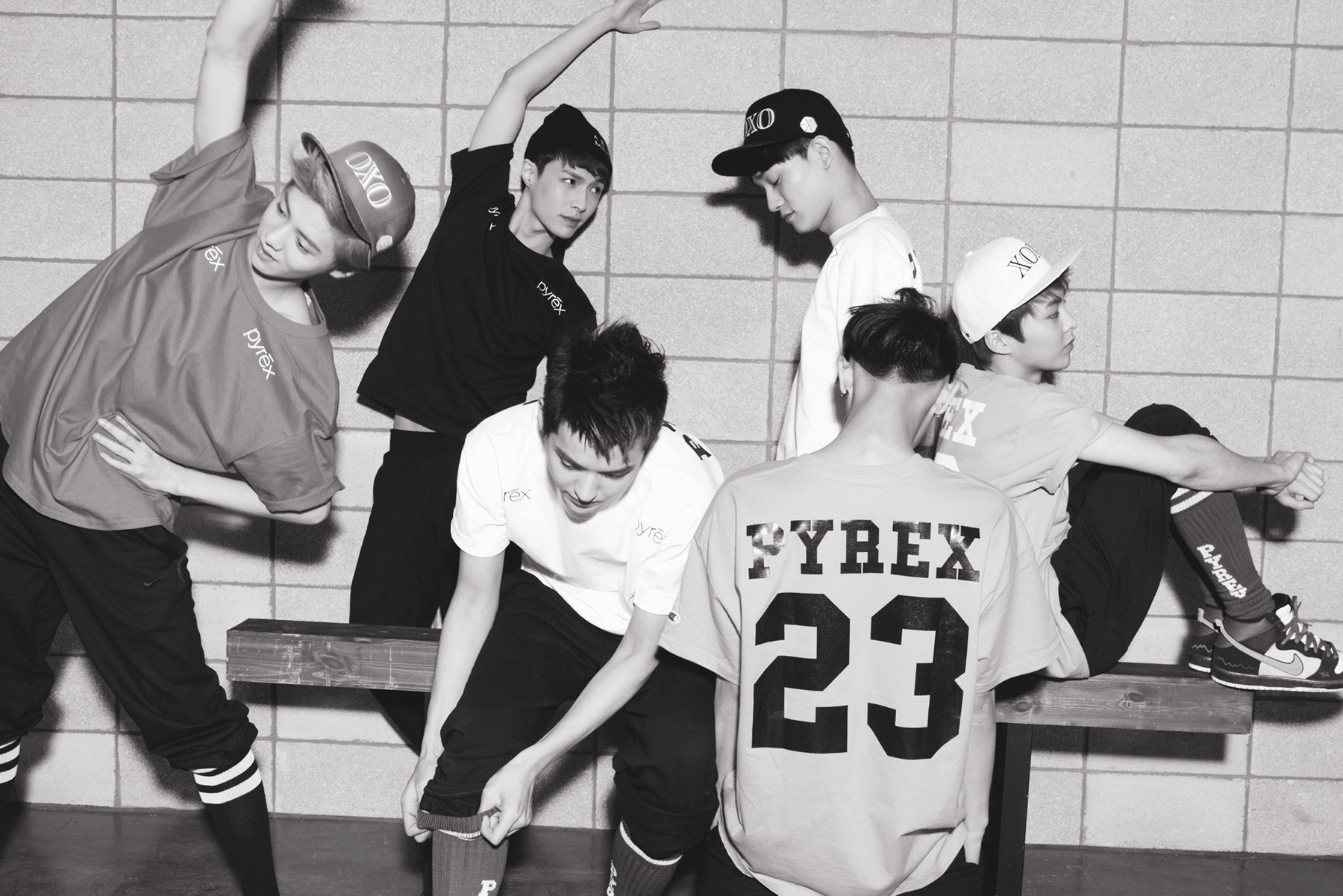
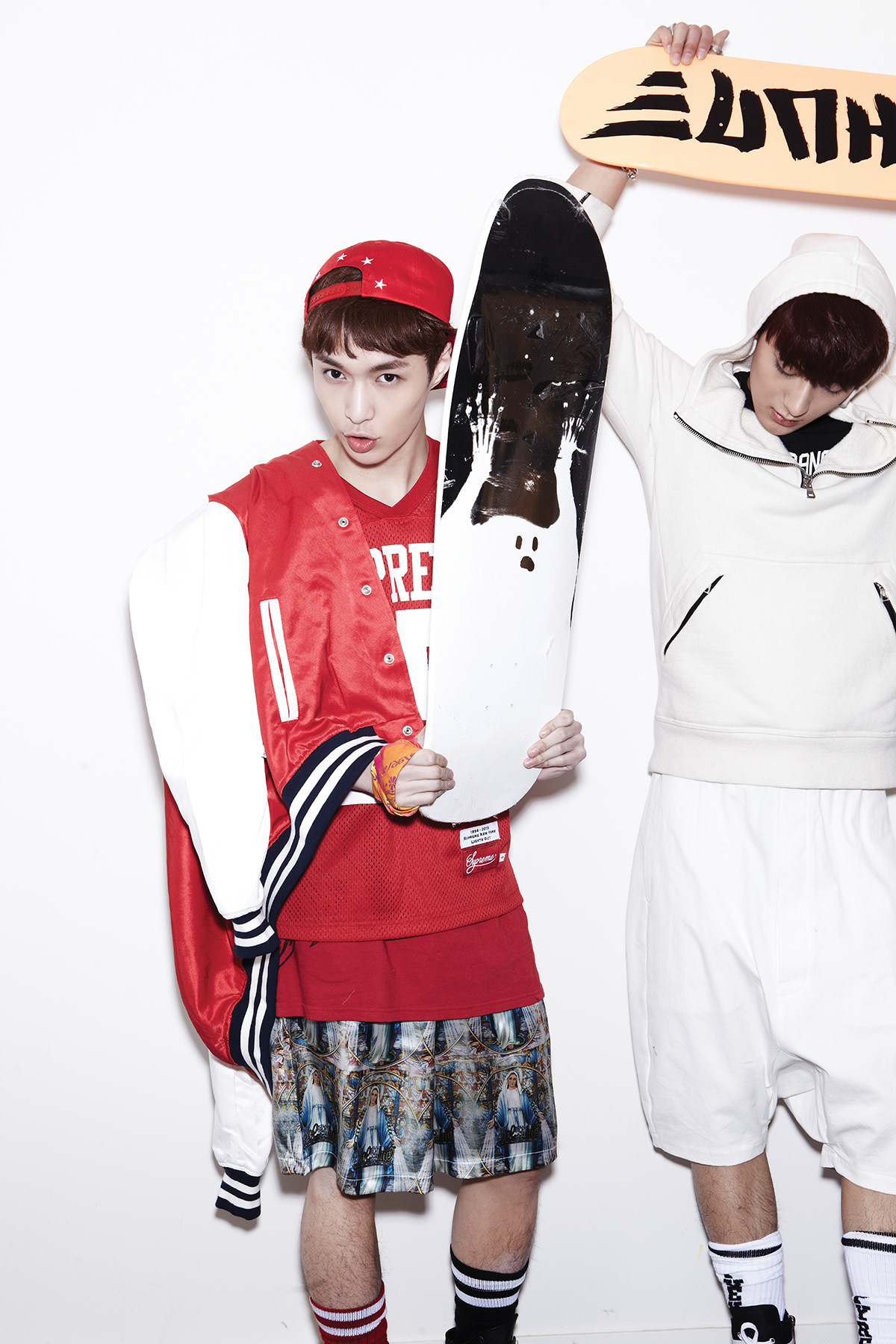
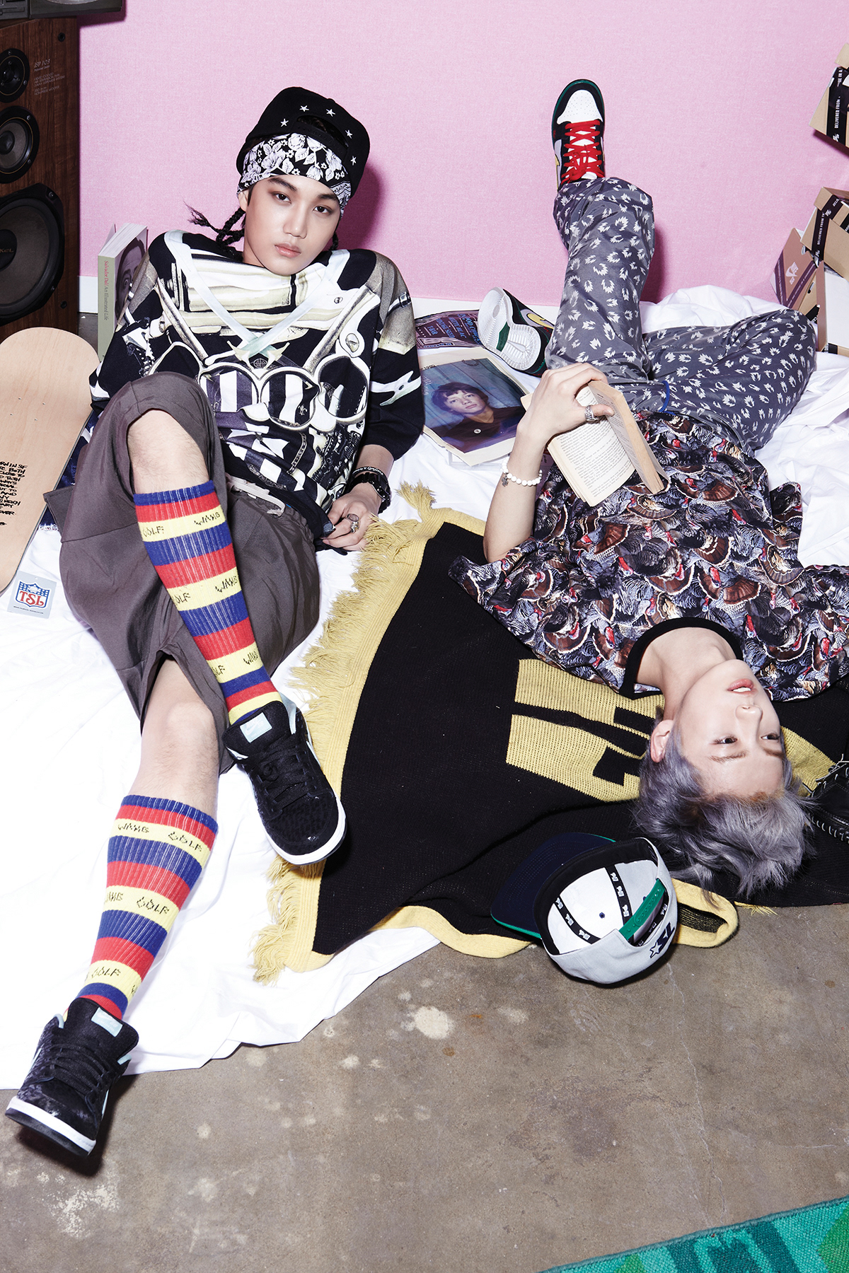
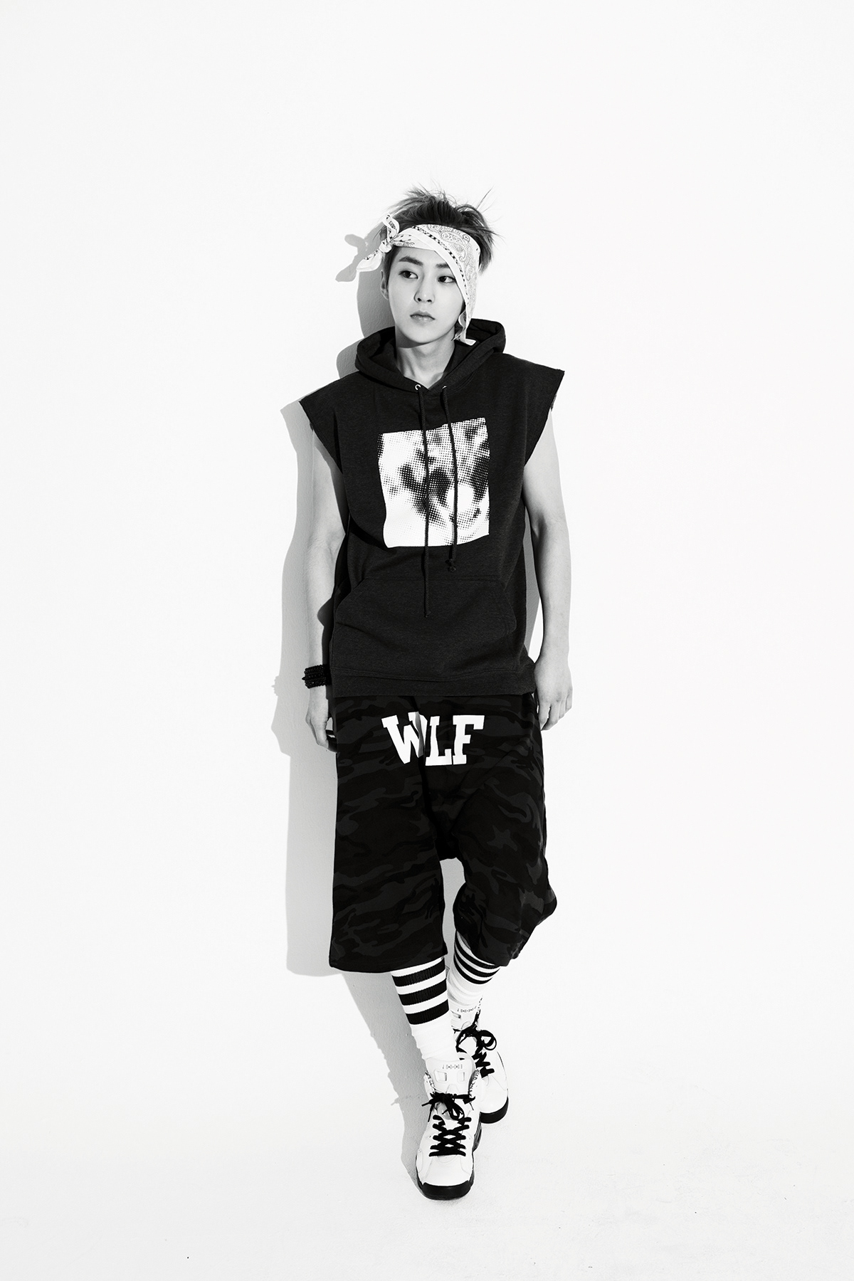
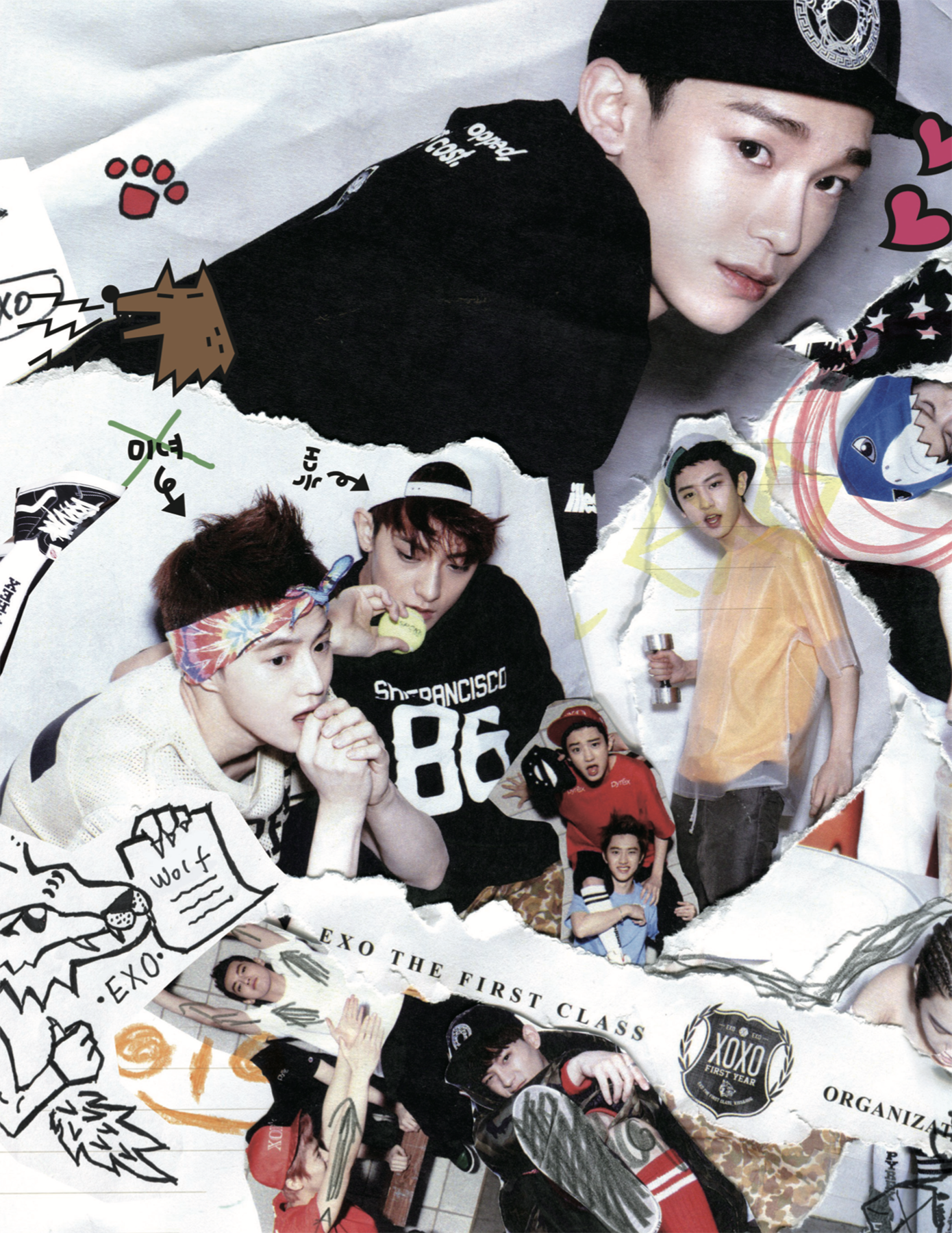
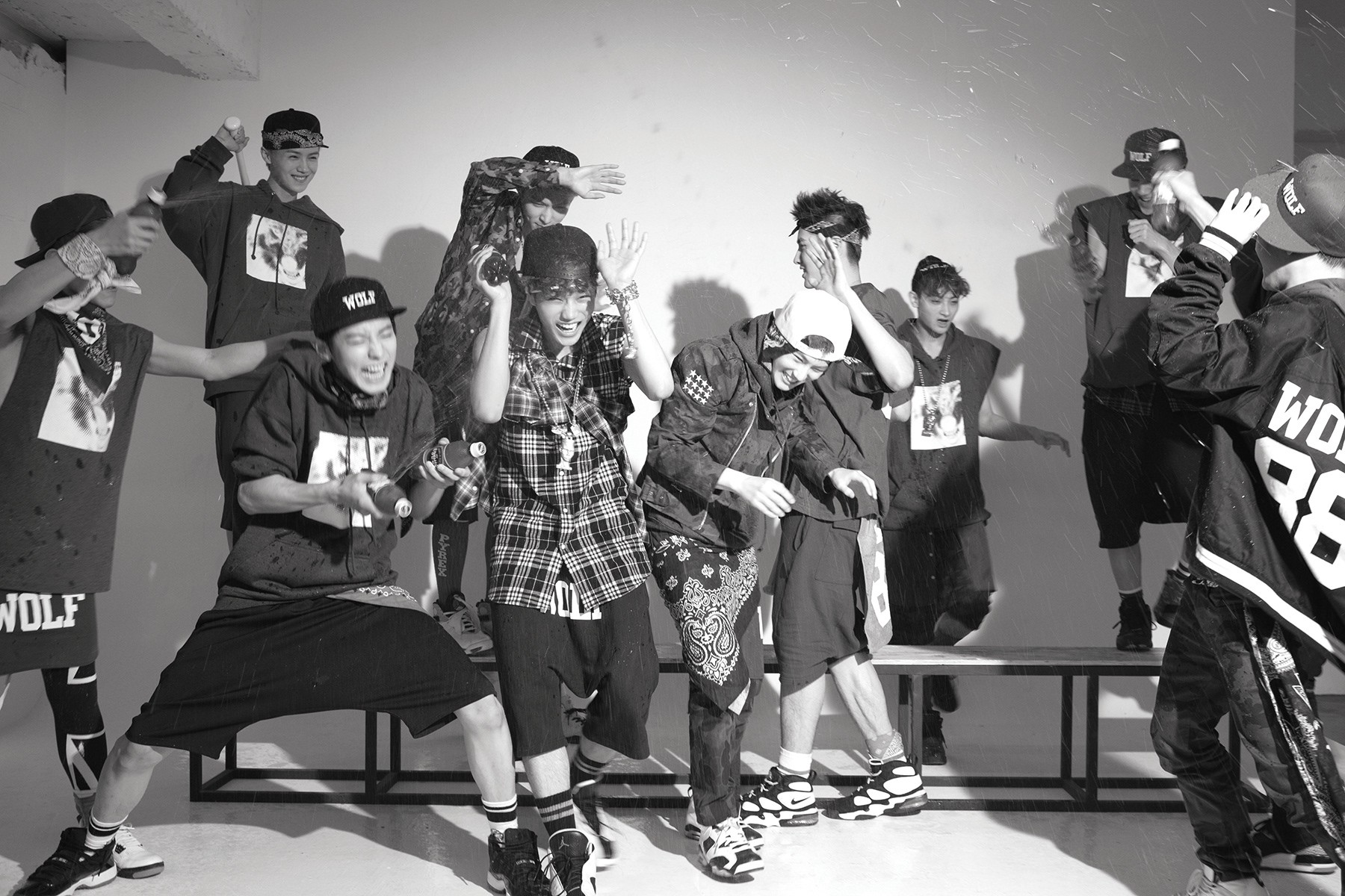
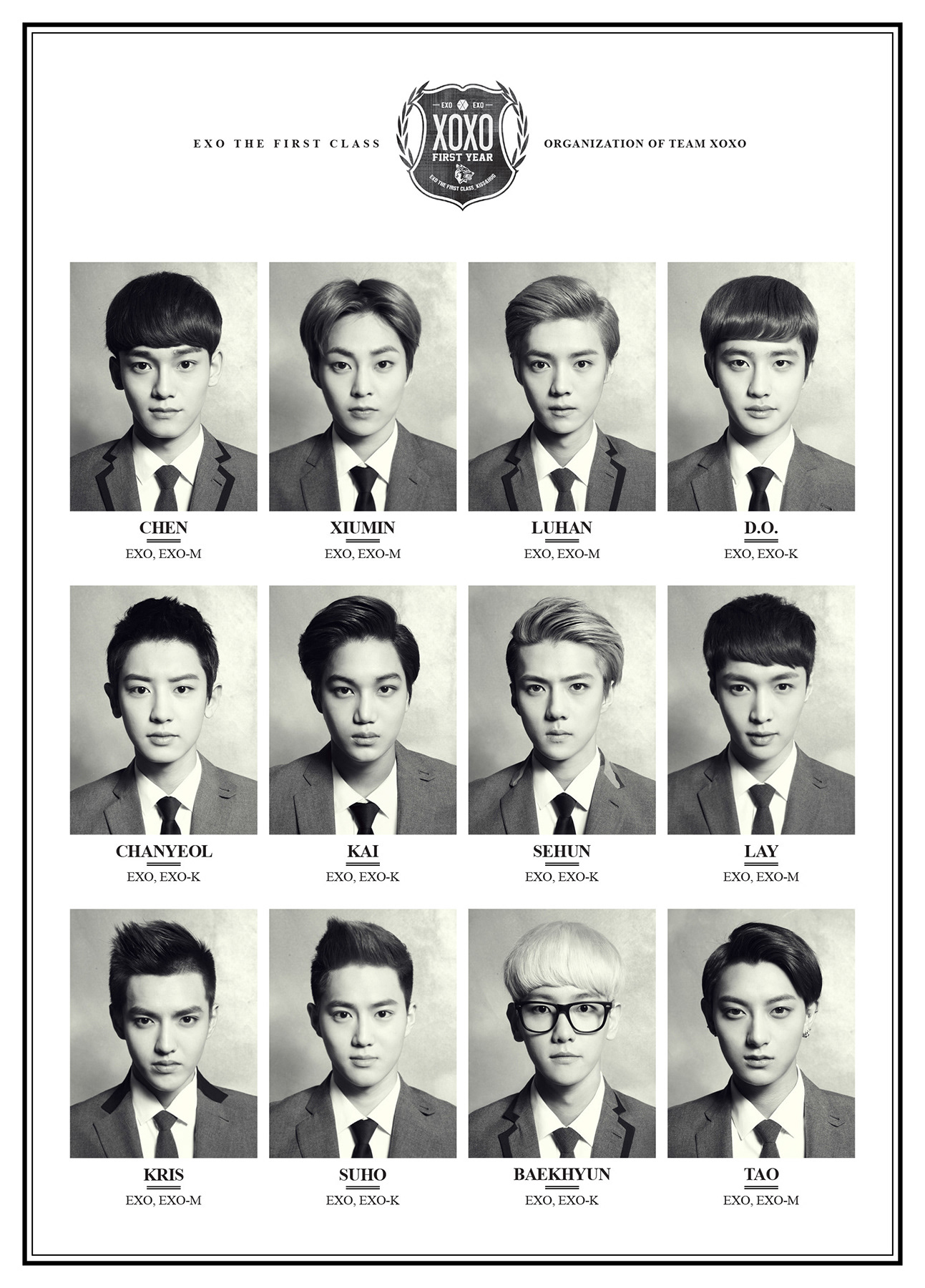
EXO’s first full-length album, this project marked the beginning of establishing the group’s universe and brand identity in a more defined way. Centered around the intimacy and connection represented by the album title [XOXO (Kiss & Hug)], familiar motifs of school and youth were combined with EXO’s unique fantasy universe to propose a new visual language. Classic elements such as school uniforms, badges, crests, and handwriting were reinterpreted through a contemporary perspective, connecting EXO’s dual identity as both youthful figures and mysterious beings into a unified brand experience. The album packaging and graphic elements expanded the framework of school and yearbook aesthetics by integrating EXO’s fantasy narrative, creating a structure where each member’s individual identity coexisted with the overall team identity.
EXO의 첫 정규 앨범이자, 팀의 세계관과 브랜드 아이덴티티를 본격적으로 구축한 프로젝트이다. 앨범명 ’XOXO (Kiss & Hug)’가 상징하는 친밀함과 교감을 중심으로, 학교와 청춘이라는 익숙한 모티브를 EXO만의 판타지 세계관과 결합하여 새로운 비주얼 언어를 제안했다. 스쿨 유니폼, 배지, 크레스트(Crest), 핸드라이팅 등 클래식한 요소를 현대적으로 재해석하며, 데뷔 초 EXO가 지닌 소년성과 미지의 존재라는 이중적인 이미지를 하나의 브랜드 경험으로 연결했다. 앨범 패키지와 그래픽 요소는 학교, year book 이라는 큰 틀에서 EXO의 판타지 서사를 녹이고, 멤버 개개인의 정체성과 팀 아이덴티티가 공존하는 구조를 형성했다.
• Concept planning & visual development • Graphic design (graphic systems, album packaging, release visuals)
• Photo production coordination • External creative collaboration coordination
• 컨셉 기획 및 개발 • 그래픽 디자인 (그래픽 시스템, 앨범 패키지, 릴리즈 비주얼)
• 촬영 컨셉 개발 및 제작 조율 • 외부 크리에이티브 협업 조율
EXO’s first full-length album, this project marked the beginning of establishing the group’s universe and brand identity in a more defined way. Centered around the intimacy and connection represented by the album title [XOXO (Kiss & Hug)], familiar motifs of school and youth were combined with EXO’s unique fantasy universe to propose a new visual language. Classic elements such as school uniforms, badges, crests, and handwriting were reinterpreted through a contemporary perspective, connecting EXO’s dual identity as both youthful figures and mysterious beings into a unified brand experience. The album packaging and graphic elements expanded the framework of school and yearbook aesthetics by integrating EXO’s fantasy narrative, creating a structure where each member’s individual identity coexisted with the overall team identity.
EXO의 첫 정규 앨범이자, 팀의 세계관과 브랜드 아이덴티티를 본격적으로 구축한 프로젝트이다. 앨범명 ’XOXO (Kiss & Hug)’가 상징하는 친밀함과 교감을 중심으로, 학교와 청춘이라는 익숙한 모티브를 EXO만의 판타지 세계관과 결합하여 새로운 비주얼 언어를 제안했다. 스쿨 유니폼, 배지, 크레스트(Crest), 핸드라이팅 등 클래식한 요소를 현대적으로 재해석하며, 데뷔 초 EXO가 지닌 소년성과 미지의 존재라는 이중적인 이미지를 하나의 브랜드 경험으로 연결했다. 앨범 패키지와 그래픽 요소는 학교, year book 이라는 큰 틀에서 EXO의 판타지 서사를 녹이고, 멤버 개개인의 정체성과 팀 아이덴티티가 공존하는 구조를 형성했다.
Logo & Graphic system
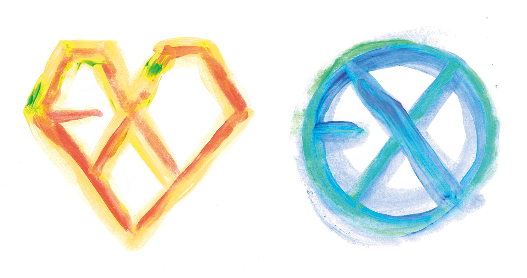
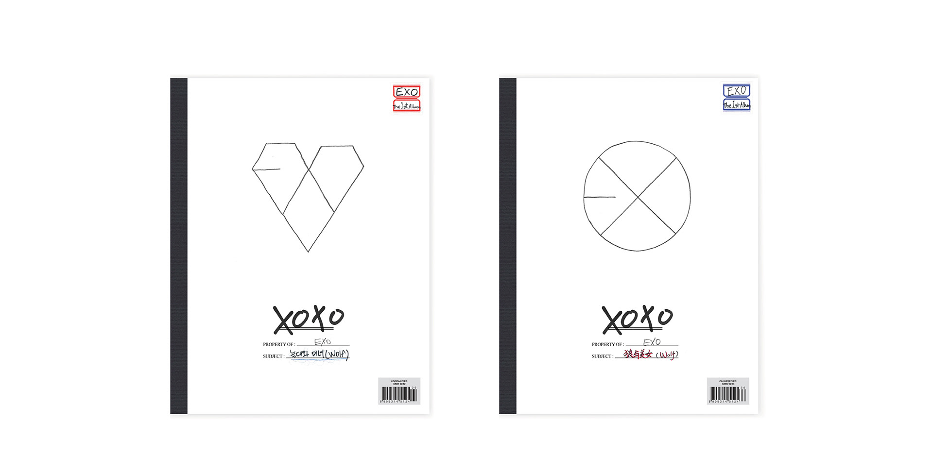
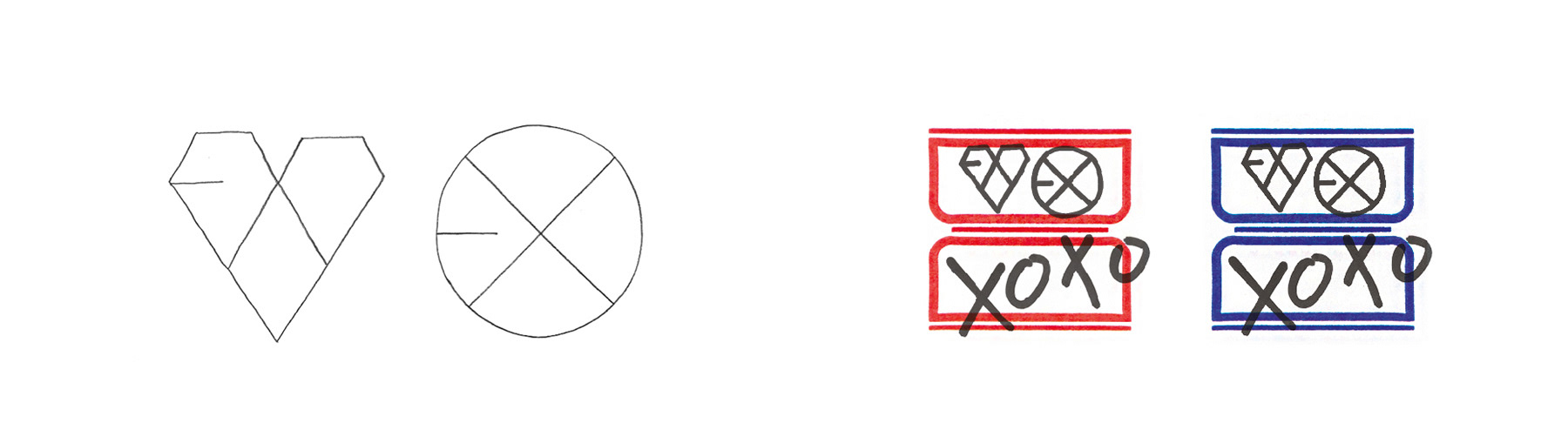
EXO established a fixed artist identity from its debut stage through a proprietary logo and visual system, representing an early example in K-pop where an artist identity was developed beyond a group name into an expandable brand asset. XOXO was the first project to present an extended variation of EXO’s signature logo system, while maintaining its distinctive logo structure. Reflecting the concept of 'Kiss & Hug' and EXO’s dual sub-unit structure of EXO-K and EXO-M, two main logo variations were developed based on pencil-drawn heart motifs and circular forms, along with a sub-logo featuring a sticker label design and digital cover designs.
EXO는 데뷔 단계부터 고유 로고와 시각 시스템을 기반으로 고정된 아티스트 아이덴티티를 구축한 K-pop의 초기 사례로, 그룹명을 넘어 확장 가능한 브랜드 자산으로서 로고와 비주얼 시스템을 운영했다. XOXO는 고유로고의 EXO가 표기되는 특징적 방식을 유지하며 확장적 변주를 선보인 첫 프로젝트이고, Kiss & Hug 컨셉과 EXO-K / EXO-M이라는 이중 서브유닛 구조를 반영하여, 연필 드로잉 기반의 하트 모티프와 원형 구조 메인 로고 2종, 견출지 디자인의 서브로고 및 디지털커버를 디자인했다.
EXO established a fixed artist identity from its debut stage through a proprietary logo and visual system, representing an early example in K-pop where an artist identity was developed beyond a group name into an expandable brand asset. XOXO was the first project to present an extended variation of EXO’s signature logo system, while maintaining its distinctive logo structure. Reflecting the concept of 'Kiss & Hug' and EXO’s dual sub-unit structure of EXO-K and EXO-M, two main logo variations were developed based on pencil-drawn heart motifs and circular forms, along with a sub-logo featuring a sticker label design and digital cover designs.
EXO는 데뷔 단계부터 고유 로고와 시각 시스템을 기반으로 고정된 아티스트 아이덴티티를 구축한 K-pop의 초기 사례로, 그룹명을 넘어 확장 가능한 브랜드 자산으로서 로고와 비주얼 시스템을 운영했다. XOXO는 고유로고의 EXO가 표기되는 특징적 방식을 유지하며 확장적 변주를 선보인 첫 프로젝트이고, Kiss & Hug 컨셉과 EXO-K / EXO-M이라는 이중 서브유닛 구조를 반영하여, 연필 드로잉 기반의 하트 모티프와 원형 구조 메인 로고 2종, 견출지 디자인의 서브로고 및 디지털커버를 디자인했다.