EXO ⸻ Logo Identity
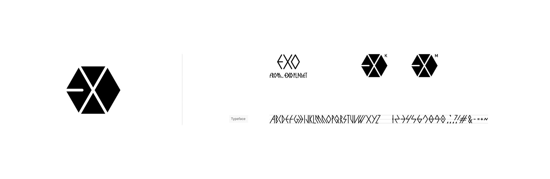
The Language of the Hexagon
Nature evolves toward creating the highest stability and efficiency with minimal energy and material. As a result, the hexagonal structure has been repeatedly selected across various systems, including honeycombs, snow crystals, basalt columns, and molecular structures such as graphene and benzene. The hexagon is a structure that maximizes spatial efficiency by filling space without gaps, while functioning as an independent form and, at the same time, a module capable of continuous connection and expansion. The hexagonal form of the EXO logo represents stability, connectivity, and scalability.
자연은 최소한의 에너지와 재료로 높은 안정성과 효율을 만들어내는 방향으로 진화하며, 그 결과 벌집, 눈 결정, 현무암 주상절리, 그래핀과 벤젠의 분자 구조 등 다양한 시스템에서 육각형 구조를 선택해왔다.
육각형은 빈틈없이 공간을 채우면서도 높은 효율을 가진 구조이며, 하나의 독립된 형태이자 동시에 끊임없이 연결되고 확장 가능한 모듈이다. 로고의 육각형은 안정성, 연결성, 확장성을 상징한다.
•
Creative Interpretation
EXO’s logo was designed based on a hexagonal structure derived from the group’s concept of beings from an unknown planet 'EXO Planet', with supernatural abilities.
The letters E, X, and O are organically integrated within the form. The early structure of EXO, consisting of two sub-units, EXO-K and EXO-M, each with six members, further reinforces this concept.
The hexagonal structure visually represents EXO’s universe, where individual beings with distinct abilities and identities are connected as one complete entity.
EXO의 로고는 ‘EXO planet’이라는 미지의 행성에서 온 초능력을 가진 존재라는 세계관에서 출발한 육각형 구조를 기반으로 설계되었고, 알파벳 E, X, O가 형태에 유기적으로 결합되어 있다.
초기 EXO는 K와 M으로 각각 6명의 멤버 유닛이 구성되었었던 점, 각기 다른 개성과 능력을 가진 존재들이 하나의 시스템으로 연결되어 완성되는 EXO의 세계관을 시각적으로 표현한다.
•
A Modular Brand Identity
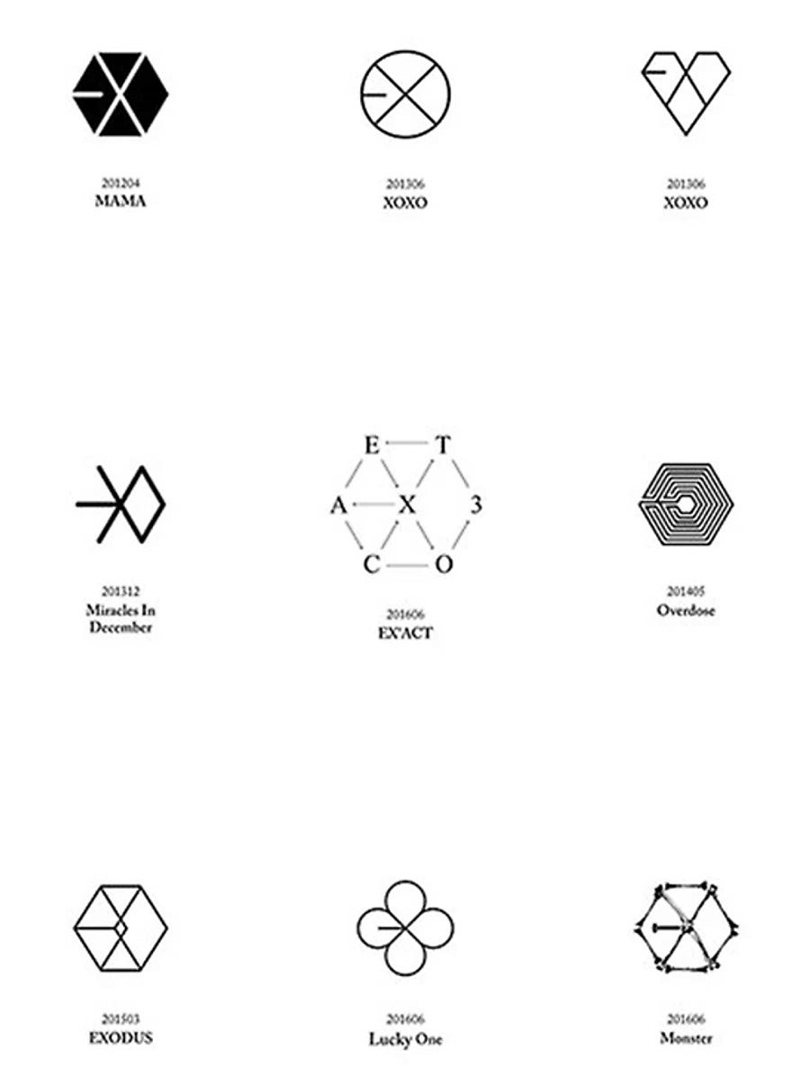
The most significant characteristic of EXO’s logo is that it was designed not as a fixed symbol, but as an expandable identity system capable of transforming across various concepts and content.
While maintaining the fundamental hexagonal structure and the distinctive visual characteristics of the EXO mark, the system allows new meanings and forms to be created according to each concept.
This became the foundation for EXO’s brand identity to function as an expandable brand asset across music, graphics, packaging, and content.
EXO 로고의 가장 중요한 특징은 하나의 고정된 심볼에 머무르지 않고, 다양한 컨셉과 컨텐츠 안에서 변형 가능한 확장형 아이덴티티 시스템으로 설계되었다는 점이다.
기본 육각형 구조와 표기적 특징을 유지하면서도, 컨셉에 따라 새로운 의미와 형태를 부여할 수 있도록 설계되었다. 이는 EXO의 BI가 음악·그래픽·패키지·컨텐츠 전반으로 확장 가능한 브랜드 자산으로 기능하도록 만든 기반이 되었다.
Nature evolves toward creating the highest stability and efficiency with minimal energy and material. As a result, the hexagonal structure has been repeatedly selected across various systems, including honeycombs, snow crystals, basalt columns, and molecular structures such as graphene and benzene. The hexagon is a structure that maximizes spatial efficiency by filling space without gaps, while functioning as an independent form and, at the same time, a module capable of continuous connection and expansion. The hexagonal form of the EXO logo represents stability, connectivity, and scalability.
자연은 최소한의 에너지와 재료로 높은 안정성과 효율을 만들어내는 방향으로 진화하며, 그 결과 벌집, 눈 결정, 현무암 주상절리, 그래핀과 벤젠의 분자 구조 등 다양한 시스템에서 육각형 구조를 선택해왔다.
육각형은 빈틈없이 공간을 채우면서도 높은 효율을 가진 구조이며, 하나의 독립된 형태이자 동시에 끊임없이 연결되고 확장 가능한 모듈이다. 로고의 육각형은 안정성, 연결성, 확장성을 상징한다.
•
Creative Interpretation
EXO’s logo was designed based on a hexagonal structure derived from the group’s concept of beings from an unknown planet 'EXO Planet', with supernatural abilities.
The letters E, X, and O are organically integrated within the form. The early structure of EXO, consisting of two sub-units, EXO-K and EXO-M, each with six members, further reinforces this concept.
The hexagonal structure visually represents EXO’s universe, where individual beings with distinct abilities and identities are connected as one complete entity.
EXO의 로고는 ‘EXO planet’이라는 미지의 행성에서 온 초능력을 가진 존재라는 세계관에서 출발한 육각형 구조를 기반으로 설계되었고, 알파벳 E, X, O가 형태에 유기적으로 결합되어 있다.
초기 EXO는 K와 M으로 각각 6명의 멤버 유닛이 구성되었었던 점, 각기 다른 개성과 능력을 가진 존재들이 하나의 시스템으로 연결되어 완성되는 EXO의 세계관을 시각적으로 표현한다.
•
A Modular Brand Identity
The most significant characteristic of EXO’s logo is that it was designed not as a fixed symbol, but as an expandable identity system capable of transforming across various concepts and content.
While maintaining the fundamental hexagonal structure and the distinctive visual characteristics of the EXO mark, the system allows new meanings and forms to be created according to each concept.
This became the foundation for EXO’s brand identity to function as an expandable brand asset across music, graphics, packaging, and content.
EXO 로고의 가장 중요한 특징은 하나의 고정된 심볼에 머무르지 않고, 다양한 컨셉과 컨텐츠 안에서 변형 가능한 확장형 아이덴티티 시스템으로 설계되었다는 점이다.
기본 육각형 구조와 표기적 특징을 유지하면서도, 컨셉에 따라 새로운 의미와 형태를 부여할 수 있도록 설계되었다. 이는 EXO의 BI가 음악·그래픽·패키지·컨텐츠 전반으로 확장 가능한 브랜드 자산으로 기능하도록 만든 기반이 되었다.
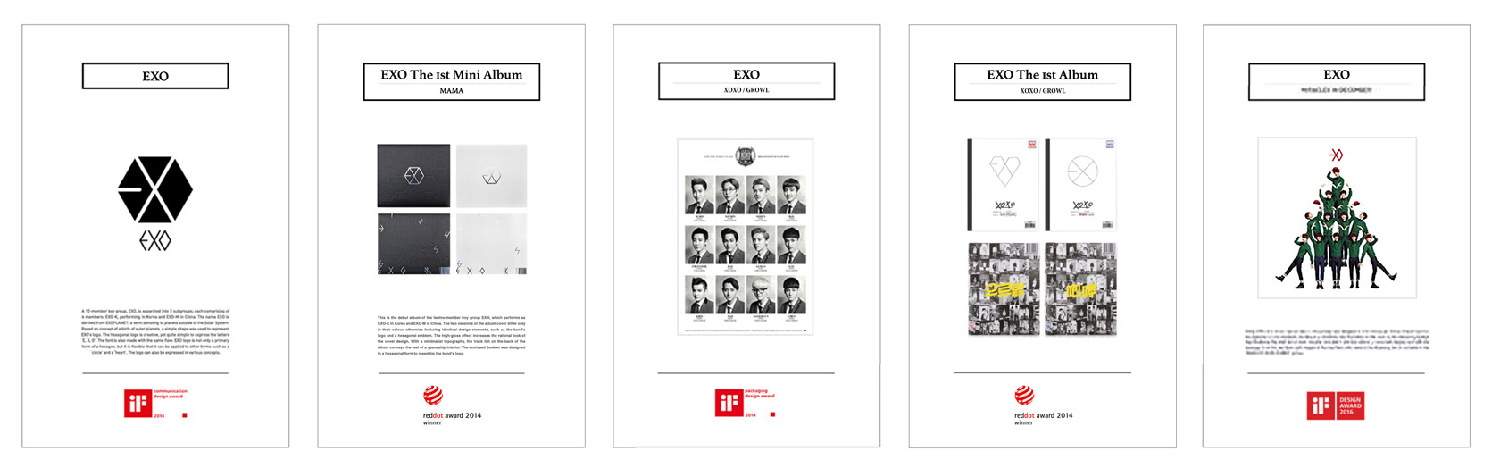
EXO Brand Identity & Album Package Design — iF Design Award & Red Dot Design Award Winner
EXO 브랜드 아이덴티티 및 앨범 패키지 디자인 — iF Design Award & Red Dot Design Award 수상
EXO 브랜드 아이덴티티 및 앨범 패키지 디자인 — iF Design Award & Red Dot Design Award 수상